-
June 26, 2025
-
3 Views
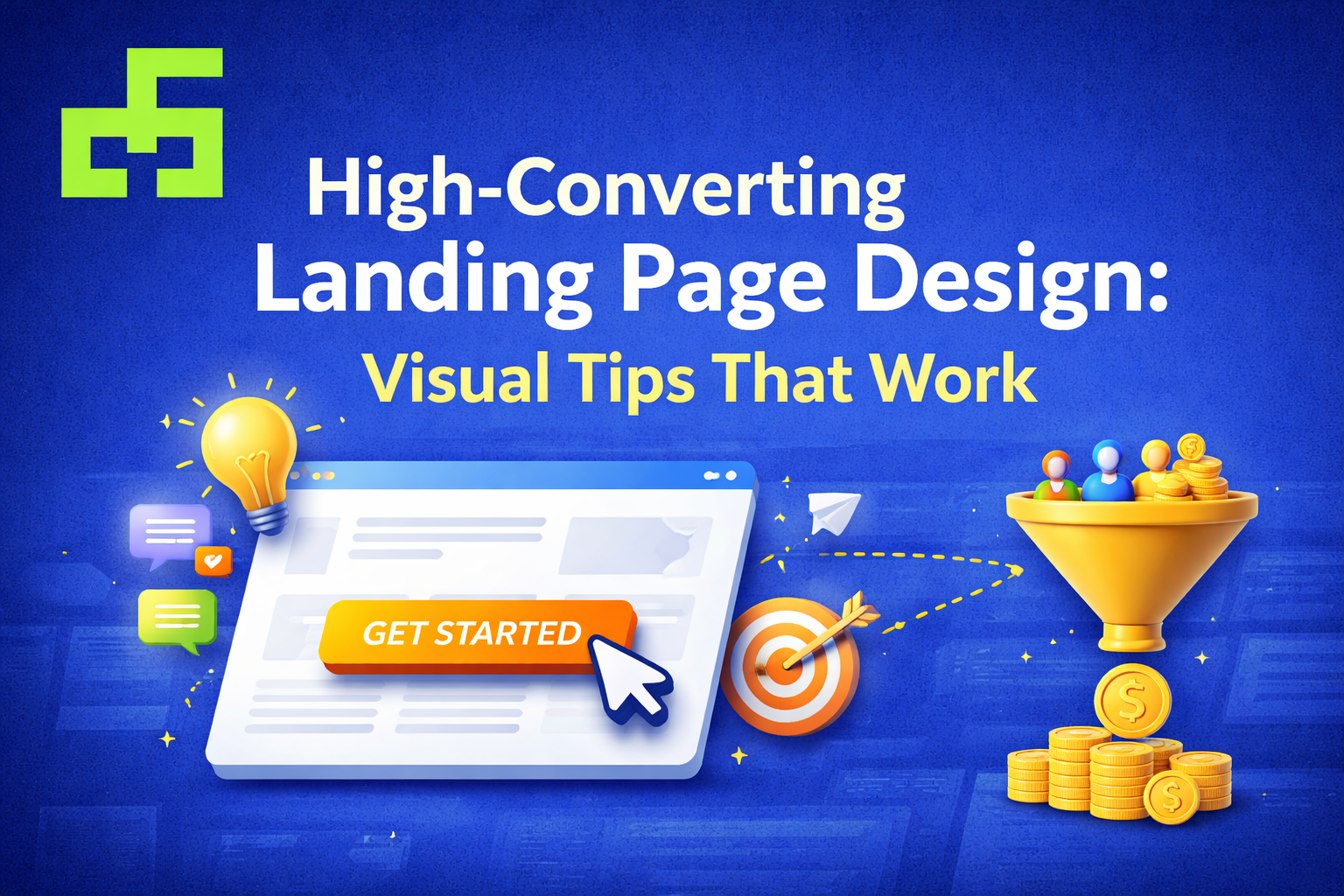
High-Converting Landing Page Design: Visual Tips That Work
A landing page has one job: turn visitors into action-takers. You can drive traffic from ads, emails, or social media—but if your landing page design doesn’t guide users clearly, conversions won’t happen. This is where conversion-focused landing page design makes the difference.
In this blog, we’ll explore how smart visual design choices can dramatically improve landing page performance and help businesses convert attention into results.
What Makes a Landing Page High-Converting
A high-converting landing page is built around clarity, focus, and intention. It removes distractions and directs users toward a single goal—whether that’s signing up, downloading, or making a purchase.
Good landing page design for conversion:
-
Communicates value instantly
-
Guides users visually toward action
-
Builds trust through consistency and structure
Design is not about adding more elements; it’s about removing what isn’t necessary.
Why Visual Design Matters for Landing Page Conversion
Users decide within seconds whether to stay or leave a page. Visual design shapes that decision before they read a single sentence.
Effective landing page visual design:
-
Creates strong first impressions
-
Makes information easier to understand
-
Reduces confusion and hesitation
When design feels effortless, users feel confident moving forward.
Core Visual Elements of a High-Converting Landing Page
Visual Hierarchy in Landing Page Design
Visual hierarchy determines what users notice first, second, and last. Headlines, images, CTAs, and supporting text must work together to guide attention.
Strong hierarchy:
-
Emphasizes the main message
-
Makes scanning easier
-
Prevents users from feeling overwhelmed
Without hierarchy, users lose direction—and conversions drop.
Layout Structure and White Space
A clean layout with proper spacing improves readability and focus. White space isn’t empty space—it’s breathing room for content.
Good layout design:
-
Separates sections clearly
-
Improves visual balance
-
Keeps users engaged longer
Simple layouts consistently outperform cluttered ones.
Landing Page Typography Design
Typography plays a major role in how content is perceived. Clear, readable fonts build trust and improve comprehension.
Best practices include:
-
Using limited font styles
-
Maintaining consistent font sizes
-
Prioritizing readability across devices
Typography should support the message, not compete with it.
Using Color and Contrast to Drive Action
Landing Page Color Psychology
Color influences emotion and behavior. Strategic color choices help guide users and reinforce brand identity.
Effective use of color:
-
Creates contrast for important elements
-
Highlights CTAs
-
Supports brand recognition
Color should guide attention—not distract from it.
Highlighting Key Sections and CTAs
Contrast helps important elements stand out. CTAs, headlines, and value propositions should be immediately noticeable.
When users know where to look, they know what to do next.
CTA Design That Converts
CTA Placement and Size
Calls to action should appear at natural decision points on the page. They must be easy to see, easy to understand, and easy to click.
Effective CTA placement:
-
Follows the content flow
-
Avoids competing elements
-
Feels natural, not forced
Button Color and Visual Emphasis
CTA buttons should stand out without clashing with the design. Size, color, and spacing all play a role in visibility.
A strong CTA doesn’t pressure users—it reassures them.
Landing Page Visual Flow and User Journey
A well-designed landing page leads users smoothly from headline to action. Visual flow ensures the journey feels intuitive.
Good visual flow:
-
Guides the eye naturally
-
Reduces unnecessary scrolling
-
Keeps users focused on one goal
Design should remove friction, not create it.
Common Landing Page Design Mistakes to Avoid
Even small design mistakes can hurt conversions. Common issues include:
-
Overcrowded layouts
-
Too many CTAs
-
Weak contrast and poor readability
-
Inconsistent branding
Fixing these issues often leads to immediate improvements in performance.
Landing Page Design Trends That Improve Conversion
Modern high-converting landing page design focuses on simplicity and purpose. Current trends include:
-
Minimal layouts with strong messaging
-
Bold typography
-
Mobile-first design approaches
-
Visual storytelling with intent
Trends should enhance usability—not replace it.
Why Professional Landing Page Design Matters
For businesses targeting global audiences, design quality is critical. A professionally designed landing page builds credibility, communicates value clearly, and supports long-term growth.
Professional landing page design services ensure:
-
Consistent branding
-
Conversion-focused structure
-
Scalable design systems
Final Thoughts
High-converting landing pages don’t happen by accident. They are the result of thoughtful visual decisions that guide users with clarity and purpose.
When design aligns with user intent, conversion becomes a natural outcome—not a struggle.
Top Category
- Design (9)
Recent Posts
Designing Email Visuals That Get Opened & Clicked
How Visual Design Guides Users from Click to Conversion
Related Articles
Designing Email Visuals That Get Opened & Clicked
-
June 26, 2025
-
13 Views
How Visual Design Guides Users from Click to Conversion
-
June 26, 2025
-
5 Views
Building a Strong Brand Identity Through Visual Design
-
June 25, 2025
-
3 Views


Leave a comment