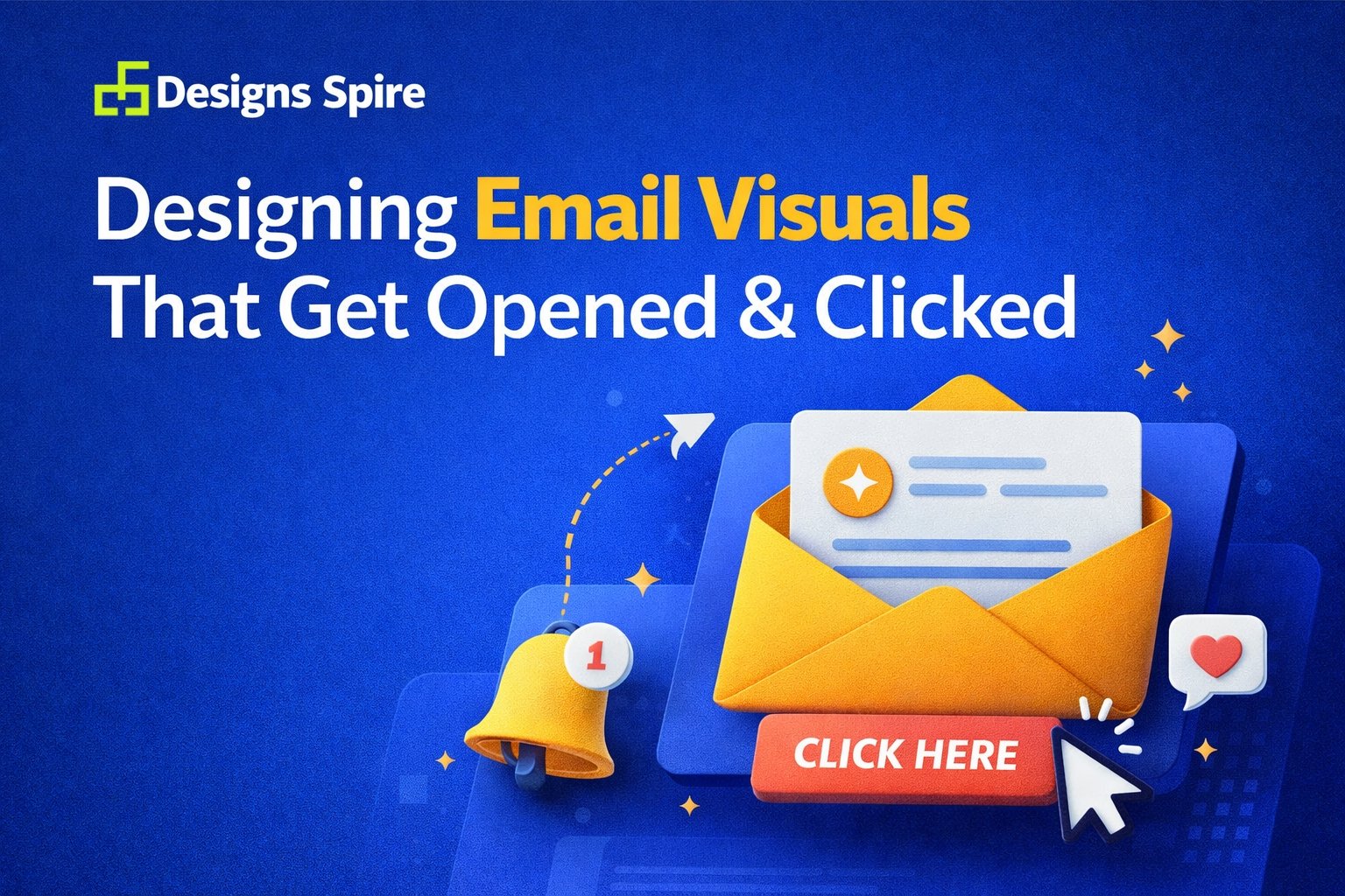
Designing Email Visuals That Get Opened & Clicked
Email marketing is still one of the most powerful digital channels—but only when people actually open and click your emails. In a crowded inbox, visual design is often the deciding factor. A well-designed email doesn’t just look good; it guides attention, builds trust, and encourages action.
In this article, we’ll break down email design best practices from a graphic design perspective, focusing on how smart visuals can improve open rates, click-through rates, and overall engagement.
Why Email Visual Design Matters
Before a single word is read, visuals speak first. Colors, spacing, typography, and layout instantly shape how your email feels.
Strong email visual design:
-
Creates a professional first impression
-
Reinforces brand identity
-
Makes content easier to scan
-
Encourages readers to click, not ignore
For businesses and global brands, consistent and thoughtful design is what separates emails that convert from emails that get deleted.
Core Principles of Effective Email Design
Visual Hierarchy in Email Design
Visual hierarchy helps readers understand what to look at first. Headlines, images, buttons, and supporting text should be arranged intentionally so the eye flows naturally from top to bottom.
Good hierarchy:
-
Highlights the main message
-
Reduces confusion
-
Improves readability and engagement
Email Typography Design Best Practices
Typography plays a major role in how your message is perceived. Clean, readable fonts work best—especially on mobile devices.
Key tips:
-
Use one primary font and one supporting font
-
Keep font sizes large enough for easy reading
-
Maintain consistent spacing and alignment
Well-chosen typography improves both clarity and professionalism.
Color Psychology in Email Design
Colors influence emotion and action. The right color palette can increase attention and guide users toward clicks.
For example:
-
High-contrast colors improve readability
-
Brand colors build recognition and trust
-
Accent colors draw attention to CTAs
Color choices should always support your brand and message—not distract from it.
Designing Emails That Get Opened
Branded Email Design Consistency
When subscribers recognize your brand visually, they’re more likely to open your emails. Consistent use of logos, colors, and layout builds familiarity over time.
A strong branded email design helps:
-
Increase brand recall
-
Establish credibility
-
Create a professional experience
Clean and Scannable Email Layout Design
Most people skim emails rather than read them word for word. A clean layout makes scanning easy.
Effective layouts:
-
Use white space generously
-
Break content into short sections
-
Balance text and visuals
Simple, uncluttered designs consistently perform better.
Designing Emails That Get Clicked
Email CTA Button Design
Your call-to-action is where clicks happen. A well-designed CTA button should be impossible to miss.
Best practices include:
-
Clear, action-oriented text
-
Strong contrast with the background
-
Enough spacing around the button
CTA design is a critical part of email design for click-through rate.
Using Visual Cues to Drive Action
Arrows, icons, directional images, and alignment can subtly guide users toward your CTA. These visual cues reduce friction and make the next step obvious.
Good design removes hesitation—and hesitation kills clicks.
Responsive & Mobile-Friendly Email Design
A large portion of emails are opened on mobile devices. That’s why responsive email design is no longer optional.
Mobile-friendly design ensures:
-
Text remains readable on small screens
-
Buttons are easy to tap
-
Layouts adapt smoothly across devices
Ignoring mobile optimization means losing engagement before it even starts.
Common Email Design Mistakes to Avoid
Even good content can fail if design mistakes get in the way. Common issues include:
-
Overcrowded layouts
-
Poor color contrast
-
Inconsistent branding
-
Too many fonts or images
Avoiding these mistakes improves clarity, usability, and trust.
Email Design Trends for Modern Brands
Email design continues to evolve. Some current email design trends include:
-
Minimal, clean layouts
-
Bold typography with fewer words
-
Visual storytelling through images and icons
Trends should be used thoughtfully—always in service of clarity and brand identity.
Why Professional Email Design Matters for Global Brands
For businesses targeting international audiences, design quality matters even more. Professional visuals communicate reliability across cultures and markets.
High-quality professional email design:
-
Builds trust with global audiences
-
Strengthens brand consistency
-
Improves engagement and conversions
Design isn’t decoration—it’s strategy.
Final Thoughts
Designing email visuals that get opened and clicked requires more than good looks. It’s about clarity, hierarchy, consistency, and purpose. When visual design supports the message, emails become powerful tools for communication and growth.
If you’re looking to elevate your email campaigns with thoughtful, conversion-focused visuals, Designs Spire specializes in crafting custom email designs that align with your brand and engage audiences worldwide.
Recent Posts


June 26, 2025
Designing Email Visuals That Get Opened & Clicked

June 26, 2025


Leave a comment