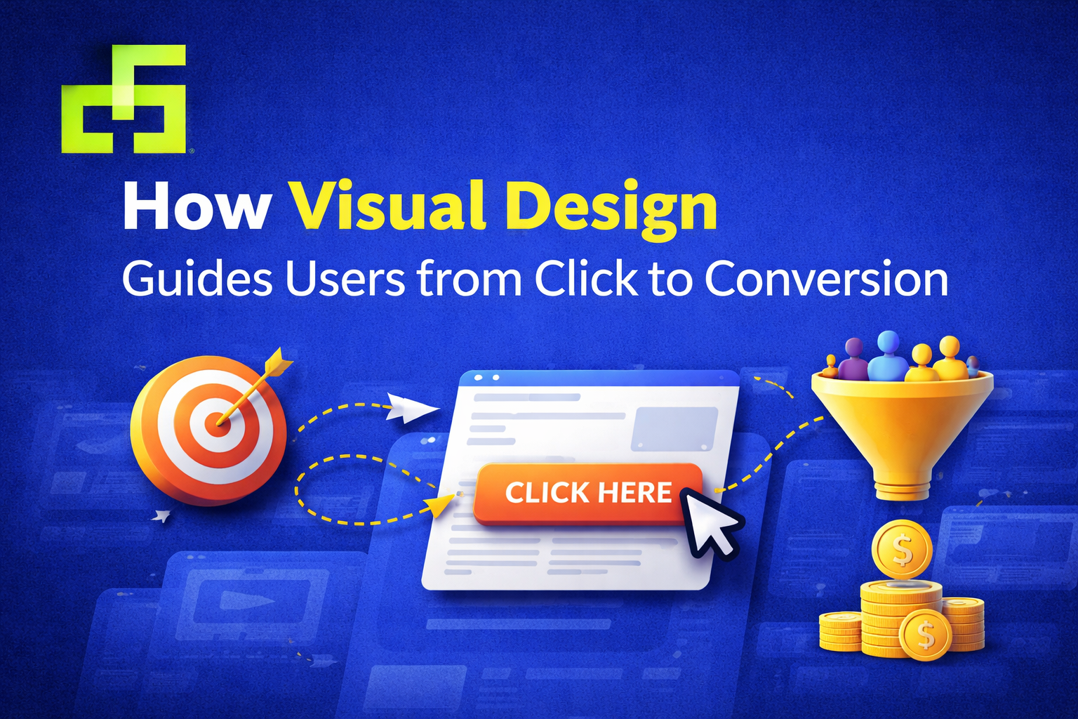
How Visual Design Guides Users from Click to Conversion
Getting someone to click is only the beginning. What happens after that click determines whether a user becomes a customer—or leaves without taking action. This is where visual design plays a critical role. From layout and color to spacing and hierarchy, design quietly guides users, reduces hesitation, and encourages decisions.
In this blog, we’ll explore how conversion-focused design helps users move smoothly from first interaction to final action, and why strong visuals are essential for turning clicks into conversions.
Understanding the Click-to-Conversion Journey
When users land on a page after clicking an ad, email, or social post, they subconsciously ask three questions:
-
Am I in the right place?
-
Can I trust this brand?
-
What should I do next?
Visual design answers all three—often before a single word is read. Every element on the page either supports the journey forward or creates friction.
Why Visual Design Influences User Behavior
People don’t process digital content line by line. They scan, pause, and react emotionally. Visuals shape those reactions.
Effective visual design for conversions:
-
Creates a strong first impression
-
Makes content easy to understand
-
Reduces cognitive load
-
Builds confidence and clarity
When design feels intuitive, users feel comfortable continuing.
Visual Design Principles That Guide Users
Visual Hierarchy and User Attention
Visual hierarchy determines what users notice first. Size, contrast, positioning, and spacing help prioritize information and guide attention naturally.
Strong hierarchy:
-
Highlights key messages
-
Emphasizes important actions
-
Prevents users from feeling overwhelmed
Without hierarchy, users don’t know where to focus—and confusion kills conversions.
Layout Structure and Content Flow
A clean, structured layout creates a logical path through the page. Well-aligned sections, consistent margins, and balanced spacing help users move from one idea to the next without friction.
Good layout design:
-
Improves readability
-
Makes scanning easier
-
Keeps users engaged longer
The smoother the flow, the higher the chance of conversion.
Color, Contrast, and Readability
Color choices influence both emotion and usability. Contrast improves readability, while intentional color use draws attention to important elements.
In conversion-oriented visual design, color is used to:
-
Separate sections
-
Highlight CTAs
-
Reinforce brand identity
Design choices should always support clarity—not decoration.
Designing for the User Journey
Guiding Users Through Clear Visual Paths
Design can subtly guide users through a page using alignment, directional cues, imagery, and spacing. These visual signals show users where to look and what to do next.
When users don’t have to think about navigation, they’re more likely to act.
Consistent Design Across Touchpoints
Consistency builds trust. When users encounter the same visual language across landing pages, emails, and social platforms, the experience feels reliable and professional.
Consistent user-focused design reduces doubt and reinforces brand credibility.
Conversion-Focused Design Elements
CTA Design Best Practices
Calls to action are the moment of decision. A strong CTA should stand out visually while clearly communicating value.
Effective CTA design includes:
-
Clear, action-oriented wording
-
Strong contrast with the background
-
Enough spacing to avoid distraction
A CTA shouldn’t shout—it should guide confidently.
Using Visual Cues to Encourage Action
Icons, arrows, imagery, and directional layouts can gently point users toward desired actions. These cues create momentum and reduce uncertainty.
Small visual details often make a big difference in conversion rates.
Common Visual Design Mistakes That Hurt Conversions
Even high-quality offers can fail due to poor design choices. Common mistakes include:
-
Overcrowded pages with no focus
-
Weak or hidden CTAs
-
Inconsistent fonts and colors
-
Poor spacing and alignment
Fixing these issues often leads to immediate improvements in engagement.
Conversion Design Trends for Modern Brands
Modern conversion-focused graphic design emphasizes clarity over complexity. Current trends include:
-
Minimal, purpose-driven layouts
-
Strong typography with fewer distractions
-
Clear visual storytelling
-
User-centered design decisions
Trends work best when they support usability and brand goals.
Why Professional Conversion-Focused Design Matters
For brands targeting global audiences, design must communicate clearly across cultures and devices. Professional design ensures consistency, clarity, and scalability—key factors in long-term growth.
Well-executed conversion design helps businesses:
-
Build trust quickly
-
Improve engagement
-
Turn interest into action
Final Thoughts
Clicks don’t convert on their own—design guides the journey. Thoughtful visual design removes friction, builds confidence, and leads users naturally toward meaningful action.
When every element has a purpose, conversion stops feeling forced and starts feeling natural. That’s the power of strategic, human-centered graphic design.
Recent Posts


June 26, 2025
Designing Email Visuals That Get Opened & Clicked

June 26, 2025


Leave a comment